
On 4 September 2026 the UN General Assembly adopted, by 164 votes to one with six abstentions, the Correct the Map resolution, which recommends using equal-area projections instead of Mercator to represent the world. It was put forward by the member states of the African Union together with the Bahamas, Togo led the negotiations, and it grew out of a campaign launched in Dakar in April 2025 by Africa No Filter and Speak Up Africa. The sole vote against was the United States.
Operationally the text does not ban Mercator, it recommends equal-area projections where relative size matters, and it asks that the limitations of any flat map be taught; Robert Dussey, the Togolese foreign minister who introduced it, acknowledged Mercator’s usefulness for navigation and said the point was not to condemn it.
My position is that those two things sit together without contradicting each other. To compare the surfaces of continents on a world map you need an equal-area projection, and Equal Earth will do. To navigate you need Mercator, and I will keep using it. They are two different questions and they want two different instruments, which makes the recommendation reasonable inside its own perimeter.
The text goes past that perimeter, though, describing the correction of those distortions as an act of “cognitive justice and memorial reparation”. That is not a technical formula and it deserves to be taken seriously, because it says the chart is a wrong to be repaired and not merely an instrument to be replaced. That is the half where my agreement stops, and I come back to it further down, once the historical context is on the table.
Claims of very different strength circulate around the resolution, and they need separating straight away. The defensible version is this: Mercator’s dominance of world maps is a nineteenth-century fact and is hard to separate from the imperial context of that century. I sign up to it, and further down I try to explain why it happened. The version I am contesting is a different one, written in August 2025 by Gabby Asare Otchere-Darko, founder of the Africa Prosperity Network: “the Mercator projection was never neutral. It was designed for conquest.” Between the two there is the same difference as between a tool a society adopts because it finds it convenient and a tool built to suit it, and the second claim needs evidence the first does not.
The most quoted formulations say something different. In 1983 Arno Peters wrote in Die Neue Kartographie that cartographers had clung to Mercator ever since he “produced his global map over four hundred years ago for the age of Europeans world domination”, a sentence that can be read as historical context or as purpose. In February 2001 the popular version reached television, in the sixteenth episode of the second season of The West Wing, where a group of fictional cartographers explain that “the Mercator projection has fostered European imperialist attitudes for centuries and created an ethnic bias against the Third World”, which speaks of effects produced, not of a design.
The difference between the two is the whole problem, and on the effect I think the campaign is right. I come back to it at the end.
Where the distortion comes from
Look at the parallels on a globe. At the equator the circle goes all the way round the Earth; climbing towards the pole it tightens, and at the pole it becomes a point. The parallel at 60 degrees is exactly half the length of the equator.
The usual way of telling Mercator is to wrap a cylinder around the globe so that it touches along the equator, carry the drawing onto it and then unroll it. The equator is the only circle already resting against the wall, so it reaches the chart as it is, while every other parallel has a smaller radius and has to be widened to reach the wall.
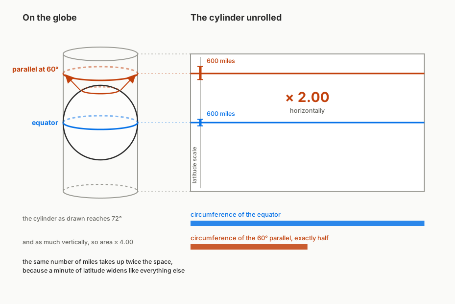
That left edge is where the practical part lives. A minute of latitude is a nautical mile at any latitude, but on the chart those minutes widen along with everything else, so the same mile at 60 degrees takes up twice the space it takes at the equator. This is why distances are picked off with dividers on the side scale, at the height you are at, never on the scale along the bottom, which is longitude and measures no miles at all.
The sum that says how much it widens is a single one. The parallel at latitude φ is cos φ times the length of the equator, so to bring it to the same length you multiply by 1 / cos φ, which trigonometry calls the secant. The chart preserves angles, and therefore shapes in the small, meaning in the neighbourhood of each point: to manage that it has to widen by the same amount vertically too, or outlines would come out squashed. Widening in both directions at once, areas grow by the square.
| Latitude | How much it stretches | How much the area grows |
|---|---|---|
| 0° | 1.000 | 1.00 |
| 15° | 1.035 | 1.07 |
| 30° | 1.155 | 1.33 |
| 45° | 1.414 | 2.00 |
| 60° | 2.000 | 4.00 |
| 66°34′ | 2.515 | 6.32 |
| 70° | 2.924 | 8.55 |
| 80° | 5.759 | 33.16 |
| 85° | 11.474 | 131.65 |
The values are worked out on a spherical model. On the WGS84 ellipsoid, which is what real charts use, the stretching comes out smaller, and approaching the poles the gap tends to 0.34%, while the one on area, which is its square, tends to 0.67%. Conformality holds in the small and not in the large: Greenland on Mercator does not have Greenland’s shape but a stretched one, while it is the angles between two crossing courses that stay true.
The 66°34′ row is the Arctic Circle, and above it sit the northern tips of Norway, Sweden and Finland, and Murmansk and the Russian Arctic. The growth is slow while you stay in the middle and turns very fast only afterwards, because the cosine goes to zero at the pole and the secant goes to infinity.
Holding areas and angles fixed together across the whole map cannot be done. At the root is Gauss’s Theorema Egregium, which forbids flattening a sphere onto a plane without deforming it, and an orange peel explains it: it either tears or it stretches, and there is no way to press it flat leaving every distance as it was. The next step, that a map both conformal and equal-area would necessarily be an isometry and therefore cannot exist, is a separate result following from it. From which a world map preserves shapes in the small or sizes, never both at once. Mercator keeps shapes in the small, Equal Earth keeps sizes, and neither is cheating.
This sum explains where the distortion comes from, and it stops there. It says nothing about the intentions of whoever chose that projection, nor about those of whoever printed it in schoolbooks three centuries later. Intentions are settled with documents, and the documents exist.
Three questions worth keeping apart
The discussion gets tangled because it runs together three things with different answers: why the chart was built, why publishers adopted it for world maps, and what effect that use may have had on the people looking at it.
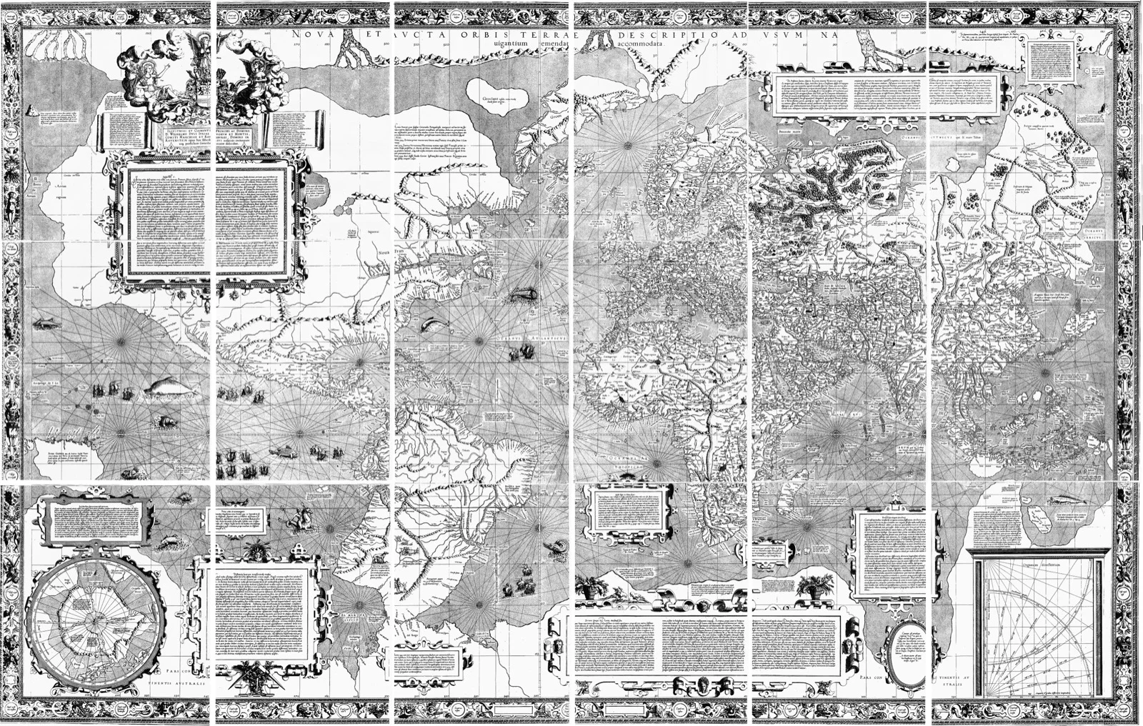
Why it was built. The 1569 chart is called Nova et Aucta Orbis Terrae Descriptio ad Usum Navigantium Emendate Accommodata, a new and enlarged description of the Earth, corrected and adapted for the use of navigators. The purpose is in the title, and the chart states it graphically too, with dozens of compass roses radiating networks of rhumb lines, visible in the cover image. The mathematics of the rhumb line had been described by the Portuguese Pedro Nunes, who in 1537 had proposed a nautical atlas of large-scale sheets to keep the distortion of directions down. Mercator knew his work, while how much it helped is unknown, because he never explained his method of construction.
That ad usum navigantium should not be read as a neutral category, though. Flemish and Iberian navigation in those years was commercial expansion, and a chart that serves to hold a course serves whoever holds that course to buy, to sell and to take. The declared purpose is technical and the context in which that technique was useful was not technical at all. Conceding this is the opposite of weakening the argument, because it is exactly the distinction I am proposing: a tool is born inside a history without thereby being that history’s instrument.
Why publishers adopted it. Here the chronology is the fact that matters. For nearly two centuries the projection could not be fully exploited in navigation itself, because it needed longitude at sea, which arrives with the marine chronometer in the mid-eighteenth century, and it needed magnetic declination to be known. Mercator only came to dominate world maps in the nineteenth century, and from that point cartographers began complaining about publishers overusing it, a protest that runs for a century before Peters.
Which leaves the question of why that century in particular, and what follows is a reconstruction of mine, offered as such. The nineteenth century is the moment when longitude at sea is a solved problem, lithography turns atlases into a mass product, and the world is thought of as a network of routes, of steamship lines and telegraph cables. The people commissioning and buying world maps were the maritime powers, and to a civilisation that pictured itself in routes a projection built on routes came naturally. Mercator’s dominance of world maps is therefore hard to separate from nineteenth-century imperialism, and that stays true without anyone having designed it for the purpose. The classroom-poster habit is a nineteenth-century publishing custom, not a choice made in 1569.
The dates of its spread and the cartographers’ protests come from the literature, and the social history of the projection is reconstructed by Mark Monmonier. The synthesis between that spread and the imperial shape of the century is mine and does not follow a specific source, in a strand that has a literature of its own going back to Brian Harley.
One thing does have to be said about the layout. The eighteen sheets of 1569 run from 80°N to 66°S, a band asymmetric about the equator that cuts off the far south and keeps all of the north, and it is from that choice that the charge of eurocentrism against the chart comes. That is a decision taken by a person in front of a sheet of paper, and it can be argued about. It holds for all of them: every chart I carry on board cuts off somewhere, and somebody decided where.
What effect it had. This is the question on which the campaign is right, and it is independent of the first two. A chart hung in a classroom for generations shapes an intuition about the proportions of the world, and on Mercator that intuition is wrong. That the effect was not designed does not make it any less real, and there is no need to attribute an intention to a sixteenth-century Fleming in order to want a different world map in a classroom.
Memorial reparation
Now that the context is in place, back to the resolution’s formula, and it should be read in the right sense. Memorial reparation does not mean compensation in money: it is the family of symbolic measures, meaning public acknowledgements, commemorations, the removal of offensive representations. Taken that way, replacing a world map that shrinks a continent can count as partial symbolic reparation, and whoever asks for it is not presenting anyone with a bill.
My disagreement remains, and I confine it to two points. The first is the object. The injured party the text identifies well, since Africa is named and the penalty described, but it charges the wrong to the projection, which is an object with no intentions. The second is that the practices which made that projection dominant on world maps are never reconstructed: who was printing it, for which markets, with what choices repeated for a century after cartographers had started protesting. That reconstruction would be the content of the reparation, and the text does not contain it.
I am not arguing that replacing the map achieves nothing. If the harm is to people’s intuitions, changing the image hanging in a classroom is a sensible measure and carries symbolic value too. I am arguing that calling it reparation without naming the act or whoever committed it leaves the work half done, and that the missing half is the one that costs.
The paradox of the fair map
The political version of the story begins in 1973, when Arno Peters presented his world map as the first to show the world fairly and accused Mercator of penalising poor countries. The projection had already been published in 1855 by the Scottish clergyman James Gall, who presented it in Glasgow under the name orthographic and described it in 1885 in the Scottish Geographical Magazine.
Peters claimed his map had “absolute angle conformality”, which for an equal-area map is impossible, and that it was the only area-correct map, while equal-area projections number in the hundreds and some are far older than his. On the underlying complaint he was not alone, though, because cartographers had been objecting to publishers’ overuse of Mercator for decades.
The geometric point is more instructive than the claims. Gall–Peters has zero distortion along the parallels 45°N and 45°S, so it renders the mid-latitudes best and stretches the low ones worst, precisely the equatorial countries it claims to defend. Between 1989 and 1990 seven North American geographic organisations passed a resolution advising against all rectangular world maps, a category that contains Mercator and Gall–Peters together. Equal Earth is not rectangular, it is pseudocylindrical with curved meridians, so that resolution does not bear on it. It was created in 2018 by Bojan Šavrič, Bernhard Jenny and Tom Patterson precisely to remedy Gall–Peters, after Boston public schools adopted it in 2017, and in publishing its specifications the authors wrote that it should be used when an equal-area projection is genuinely required, warning against making it the default choice for world maps. The full reconstruction of the controversy is in Mark Monmonier’s Rhumb Lines and Map Wars.
Inferring the purpose from the effect
The error holding the storytelling up is a single logical step, and it reaches well beyond maps. The distortion always runs in the same direction, and what is systematic resembles what is deliberate. But regularity is exactly what you would expect from a formula, and the fact that something confers an advantage does not mean anyone set out to confer it.
Put better, it is a question of the burden of proof. Whoever claims a thing was made for a purpose has to show it, and it falls to nobody else to show the contrary. In the case of 1569 that proof is absent: there is a title declaring a nautical use, there are the networks of rhumb lines on the sheet, and there is no document attributing a second motive to Mercator. This does not establish that navigation was his only purpose, because that cannot be established, nor that he acted in good faith. It establishes that the strong claim is left unsupported, and that is enough, because it was the one that had to be supported.
The intentional explanation is attractive because it is cheaper. It gives a culprit, a date and a remedy, and it lets a wrong be corrected by replacing an object. The structural explanation asks more work and grants less satisfaction, because it says a tool built for one reason was adopted for another by a society that found it convenient.
That explanation has to be kept within its limits too. That no evidence of intent exists for 1569 says nothing about what nineteenth-century publishers wanted, which I have not researched and which would be a separate inquiry, with its own archives and possibly different findings. Nor am I claiming that structural explanations are generally the right ones, which would be the same shortcut in reverse. I am claiming only that here, for the assertion that the chart was designed for conquest, whoever makes it has brought nothing.
Anyone working on technical systems meets this jump constantly, because every default setting, every interchange format, every threshold produces regular winners and losers. Each time you can ask who benefited, or you can ask what problem whoever wrote it was solving, and those are two different questions with different answers. The first on its own proves nothing about the second, and the second on its own absolves nobody of the effects of the first.
What I use when I go out to sea
The criterion shows up better on a concrete case, and what I have to hand is a nautical chart.
A working chart covers a handful of minutes of latitude. The one I keep open for the Tuscan archipelago runs from the mouth of the Arno to Capraia, thirty-eight minutes, and inside that band the scale changes by one per cent from one edge to the other. The area distortion the UN is discussing does not even show in there.
What does have to remain true is the angle. Hold the bow on one compass number, say 240 degrees, and the path you trace over the globe is a complicated curve that on almost any chart comes out bent. On Mercator’s it becomes a straight segment, so you draw it with a parallel rule and read the angle off the compass rose. Livorno to Portovenere is thirty-six miles with the bow on 326, and between that course and the shortest way there are ten centimetres in it. Mercator himself noted that by that route a ship does not arrive by the shortest way, but it does arrive.
I have sailed those waters, and elsewhere the property that has to hold is a different one. At the Glénans, ten miles off Concarneau, what keeps you awake is the tide, worked out with the SHOM coefficient and the rule of twelfths to know the height of water when you pass. Further north it is the geometry that presents the bill, because above seventy degrees the scale factor passes 2.9 and keeps growing without limit, the poles do not fit on the sheet and charts are built as seen from above the pole. Each time the instrument changes because what cannot be wrong changes, and on board nobody finds it odd.
What a chart has to preserve
The useful question is not which map is right, because none of them is, but which property has to be held fixed to answer the question you have in hand.
If the question is how big Africa is compared with Greenland, the property to preserve is area, the map is equal-area and the UN’s choice is the correct one. If the question is what angle to hold to reach Portovenere, the property to preserve is angles, the chart is conformal and it is Mercator. If the question is the shortest way across an ocean, neither will do and you need a gnomonic, where great circles come out straight.
Between 4 September and the days that followed, three countries contested the map, and none of the three contested the projection. Ukraine, which stated that it does not oppose the resolution’s core principles, abstained: its permanent representative Andrii Melnyk objected that on the map Crimea appears in a lighter shade than the rest of Ukraine and closer to the Russian one, and said Kyiv had asked for corrections before the vote without receiving positive answers. Japan, through Chief Cabinet Secretary Minoru Kihara, asked for corrections because the Kuril Islands, which it calls the Northern Territories, are coloured like Russian territory. India, through foreign ministry spokesperson Randhir Jaiswal, objected that Kashmir must be depicted according to India’s official map.
Shades, borders and names are not properties of the projection but decisions taken by whoever draws that map, and Kyiv’s request for a correction demonstrates it better than any argument: something that can be corrected on request is not a geometric constraint.
The European Union put this in writing in its explanation of vote, specifying that the resolution “does not imply recognition of, support for, or acquiescence in any claim concerning disputed territories, changes to existing borders, or alterations to the legal status of any territory, nor does it endorse any specific website, such as equal-earth.com, including the maps contained therein”. It is the distinction this whole article is about, made in the chamber by somebody else: the projection decides how a sphere is flattened, the borders and the colours are decided by a person.
A chart is an instrument that declares what it preserves and what it lets go. Once that is settled, which one to hang in a classroom is an educational decision, and it can be a political one perfectly legitimately. The question you start from stays the same either way: what has to remain true, because everything else is lost regardless.
- Nicola Ciccoli on MaddMaths, the mathematics of the affair, in Italian — https://maddmaths.simai.eu/divulgazione/distorsioni-cartografiche/
- The official record of the 4 September session, with the explanations of vote — https://press.un.org/en/2026/ga12779.doc.htm
- UN News on the vote — https://news.un.org/en/story/2026/09/1168284
- The European Union’s explanation of vote, with the caveat about the website — https://www.eeas.europa.eu/delegations/un-new-york/eu-explanation-vote-un-general-assembly-resolution-correct-map-rebalancing-global-cartographic_en
- Al Jazeera on the objections from Ukraine, Japan and India over the depiction of territories — https://www.aljazeera.com/news/2026/9/11/japan-india-ukraine-why-some-countries-are-uneasy-about-new-un-map
- The Correct the Map campaign — https://correctthemap.org/
- Gabby Asare Otchere-Darko, the chart “designed for conquest” — https://africaprosperitynetwork.com/the-mercator-map-a-colonial-lie-that-shrank-africa-then-divided-it/
- Arno Peters, Die Neue Kartographie, 1983, the source of the political reading — https://openlibrary.org/search?q=Die+Neue+Kartographie+Peters
- The West Wing, the episode with the fictional cartographers — https://en.wikipedia.org/wiki/Somebody%27s_Going_to_Emergency,_Somebody%27s_Going_to_Jail
- Mercator’s 1569 chart, sheets and translated legends — https://en.wikipedia.org/wiki/Mercator_1569_world_map
- James Gall’s 1885 paper in the Scottish Geographical Magazine — https://doi.org/10.1080/14702548508553829
- The history of the Gall–Peters projection and the controversy — https://en.wikipedia.org/wiki/Gall%E2%80%93Peters_projection
- Mark Monmonier, Rhumb Lines and Map Wars, the reconstruction of the controversy — https://www.bibliovault.org/BV.landing.epl?ISBN=9780226534329
- Equal Earth, with its authors’ caveat on use — https://en.wikipedia.org/wiki/Equal_Earth_projection
- John Milnor, A Problem in Cartography, 1969 — https://doi.org/10.1080/00029890.1969.12000424
- SHOM and the French tidal coefficient — https://maree.shom.fr/
Cover image: Gerardus Mercator, “Nova et Aucta Orbis Terrae Descriptio ad Usum Navigantium Emendate Accommodata”, 1569, composite of the eighteen sheets of the Basel copy, photographed by Wilhelm Krücken — public domain — https://commons.wikimedia.org/wiki/File:Mercator_1569_world_map_composite.jpg